Team members
Depending on the size of your company, some of these roles may be the same person. This sprint it is important we identify these roles and get in contact with them.
In this sprint, you will design your user experience. This is your blueprint for how you want your users to interact with your search and discovery experience. Once you’ve completed the tasks below, you can move onto the next sprint.
Depending on the size of your company, some of these roles may be the same person. This sprint it is important we identify these roles and get in contact with them.
Project Manager
Planning and project oversight
Product Manager
Product vision, planning, prioritizing and management
UX Designer
Create experiences for users via design prototyping
Front End Engineers
Build application and visual and interactive elements
To have a clear end goal for your team, you need to map out exactly what you want your users to see at each stage of their search journey. There is a large ecosystem of design software—more professional offerings include Figma and InVision Studio, but you can just as easily use Miro or even a piece of paper. When designing the UX, you should keep accessibility guidelines in mind. You should also ensure that the experience you are designing keeps mobile in mind and that your design works well across all screen sizes.
If you’re not sure where to start, check out the Algolia inspiration library. For e-commerce use cases, you can rely on UI Design Kit for best practices. It includes predefined yet customizable components and is available in the Figma community.
Each of the sections below details a stage in the user’s journey and includes some questions to ask when designing.
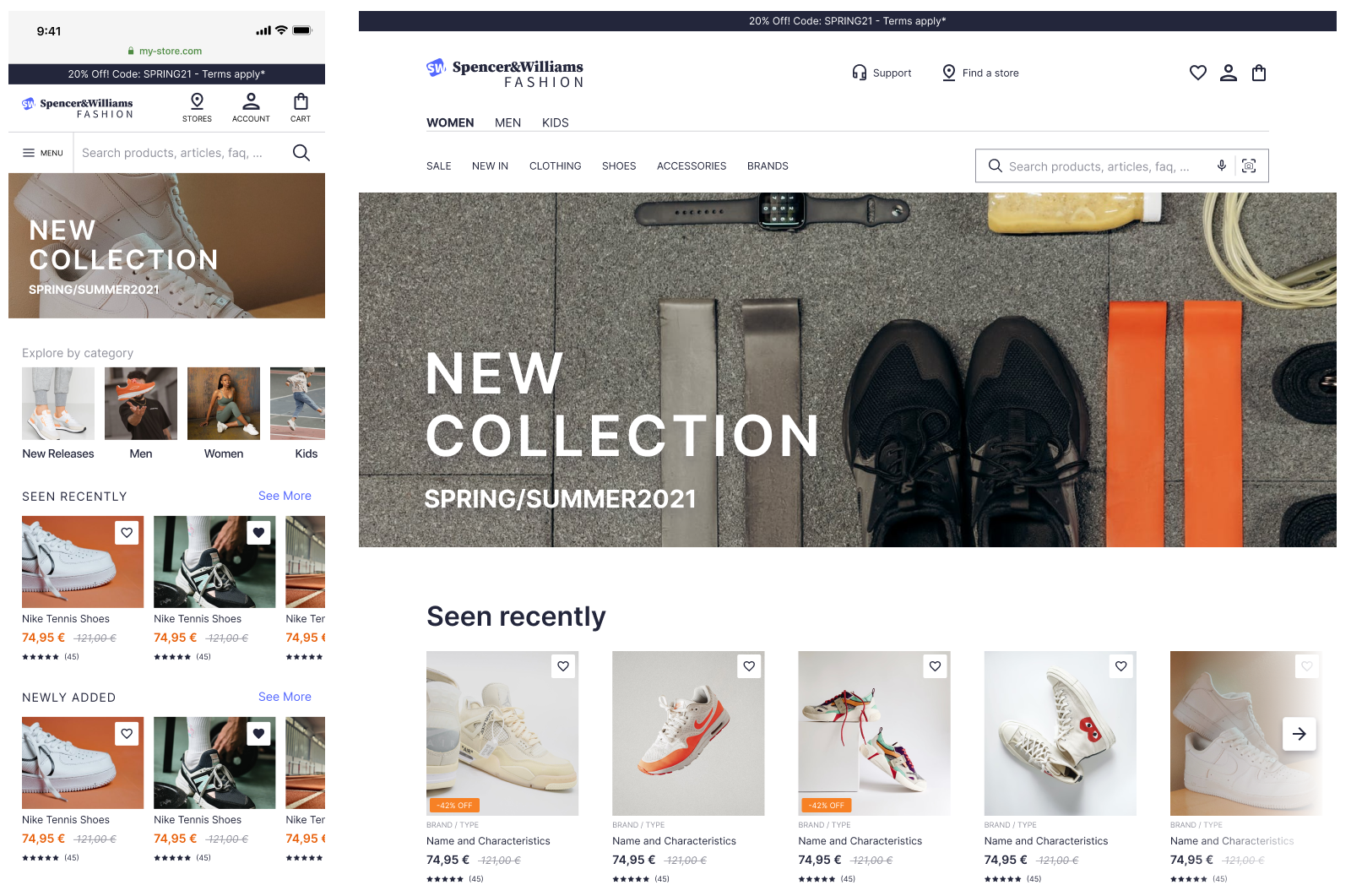
The larger the search bar, the higher the engagement. It's always better to present the search bar in a ready-to type state, not hidden by an icon. Traditionally, users look for search bars in the top right hand corner of the screen.
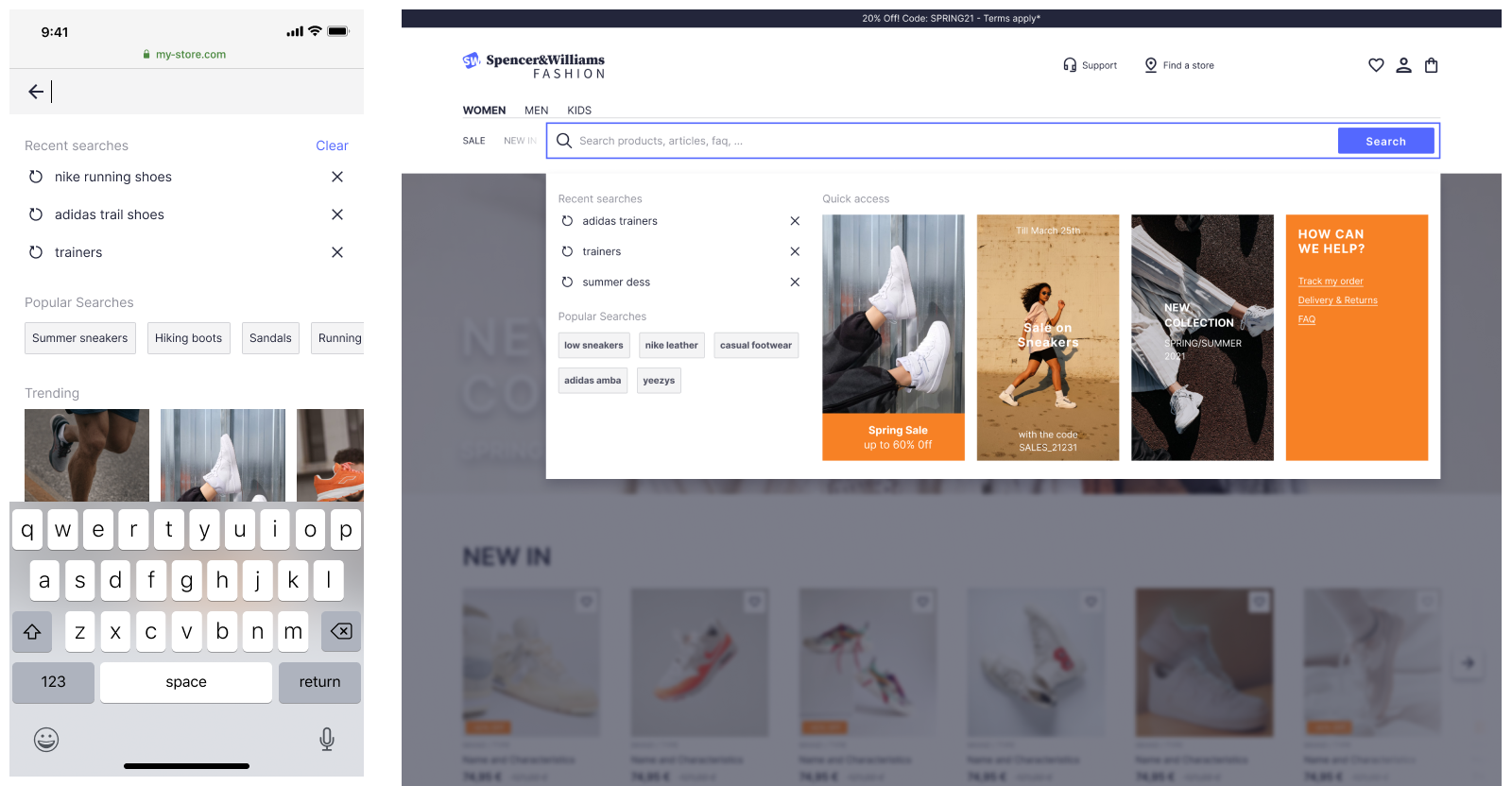
As soon as users interact with the search bar, they receive feedback. This is the opportunity to provide further prompts and promotions to your users. It could be in the form of user search history, trending products, or suggest search terms.
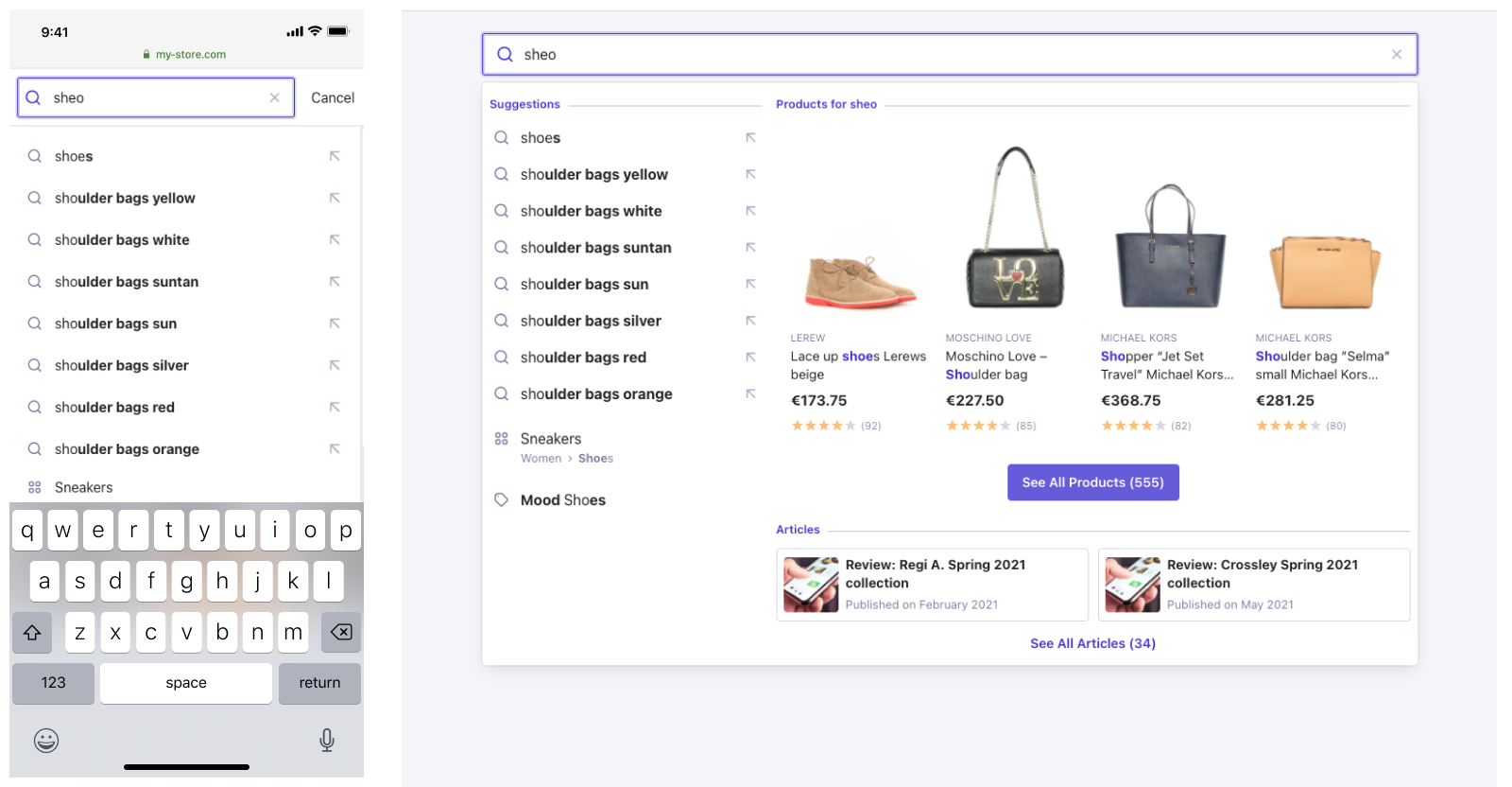
For desktop websites, there are two main patterns that provide users with an as-you-type experience: instant search and autocomplete.
Instant search puts your results front and center and removes the need for a separate result page. This works well for results with good visuals and for site search. See this ecommerce example from our inspiration library.
Autocomplete, in contrast, provides an overlay where you can federate information from multiple sources. See this federated search example from our inspiration library.
On mobile, the interaction interface is more prone to error. Query suggestions are the best way to get a user to results that are relevant to their intent.. They help users type less and get to results more quickly. See this example from our inspiration library.
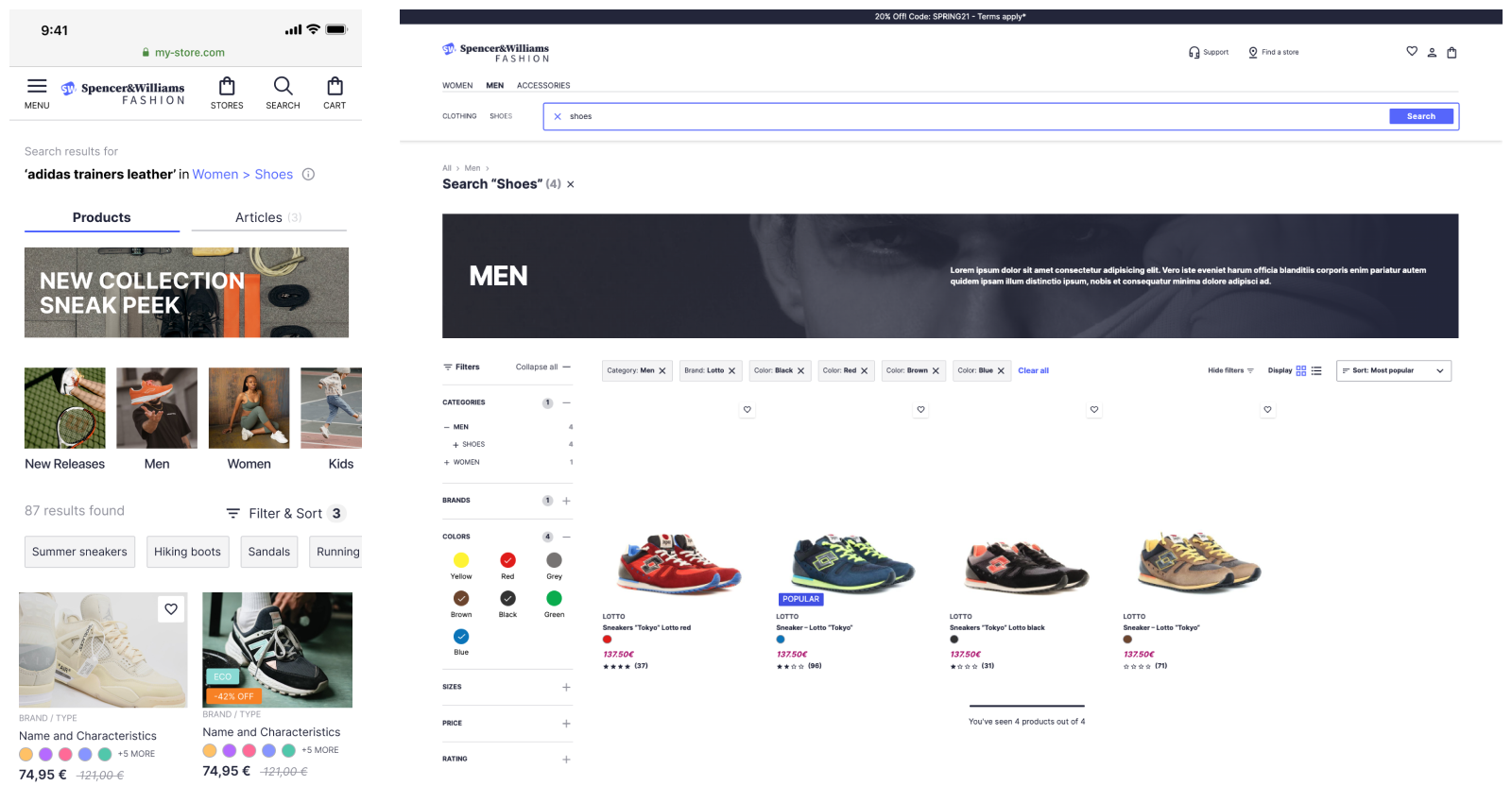
For desktop experiences, it’s traditional to find facets on the left hand side. Over the last few years, fashion retailers have begun to use drop downs above the results. The latter option reduces engagement but provides more space to display products.
For mobile experiences filters are often in a separate panel.
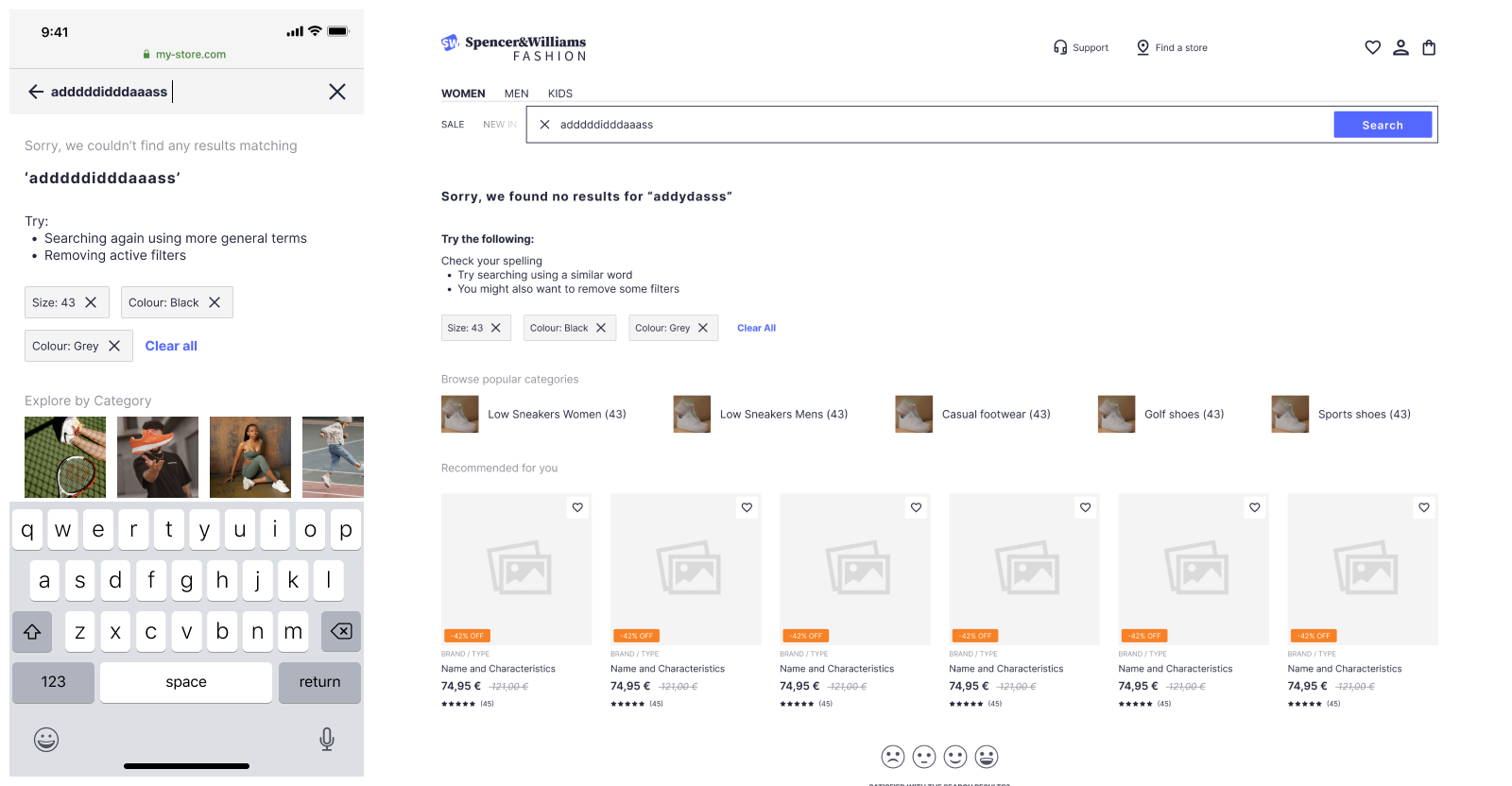
Sometimes users may search for products or content that doesn’t exist in your catalog. Rather than presenting irrelevant results, it’s best to provide them with a helpful no results page that shows other options for a continued journey.See this example of a no results page.
Users interact with your site by clicking on search results, viewing category pages, or adding items to a shopping cart. Capturing these user events lets you understand more about your users and unlocks advanced features and functionality. Algolia calls these user events Insights events.
Now is the appropriate time to plan which user events insights to send so you can implement them without friction later on.
You can do this directly in your mock ups as seen here, or you can make a copy of this template to note down which events you would like to include. This documentation explains which events need you need to send Refer to this documentation for a list of event types.